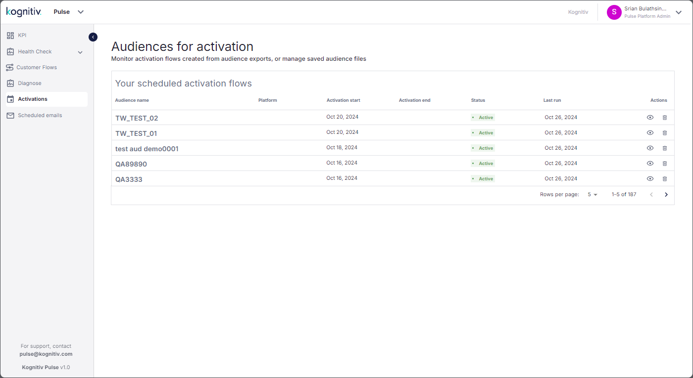
Click Activations to open the Audiences for Activation page.

Audiences for Activation Page
The Audiences for Activation page lists the schedule activation processes set up via the Diagnose page (See Diagnose).
The list will display the name of the audience file, the activation platforms which will consume the audience file and the frequency for sending notifications to the customers included in the activation campaign.
By default, the process that was added last will be displayed at the top of the list.
Click on the view option to view the details of the scheduled process.

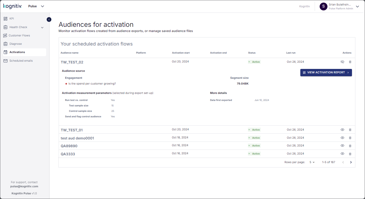
Scheduled Activation Detailed View
The detailed view will display the date which the schedule was submitted, problem area which will be addressed by the scheduled activation campaign, the selected diagnosis question and the total number of customers belonging to that segment. Also, Pulse will display details of the parameters used for measuring the impact of the activation campaign.
Click the VIEW ACTIVATION REPORT option to view the report on the impact of the activation campaign on the customer base.

Activation Overview Page
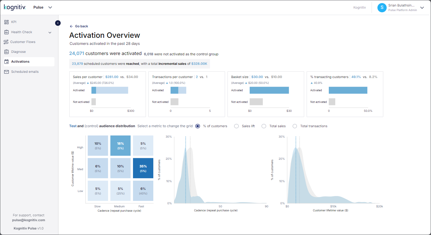
By default, Pulse will display the activation report for the duration deduced by Kognition AI/ML engine according to the customer cadence. The evaluation duration will be displayed at the top of the report.
Below that, the number of customers that were targeted by the activation campaign (test group) and the number of customers that were set aside as the control group will be displayed. Note that Pulse will display the test group data in blue color while the test group data will be displayed in gray color. Also, the number of customers that were successfully reached (i.e., the customers viewed the notification sent by the activation campaign) and the total value of the incremental sales which resulted due to the activation campaign will be displayed.
The four tiles displayed in the Activation Overview report will provide the impact on the Spend per Customer, Transactions per Customer, Transaction Value and Total Transactions. The tiles will display the comparison between the test group and the control group and the positive/negative change due to the activation campaign. The negative changes will be indicated using red arrows (▲/▼) and the positive changes will be indicated by blue arrows (▲/▼).
The 3×3 grid in Activation Overview screen provides a view of the change in customer behavior due to the activation campaign. The vertical axis represents the Customer Lifetime Value (CLV) and the horizontal axis represents the customer cadence, i.e. the Customer Cycle (CC). The grid will use different shades blue to indicate positive changes and different shades of red to indicate negative changes.

Positive Change Color Scheme Range
The color scheme consists of 6 shades of blue, ranging from Blue-2 to Blue-7. These colors represent the positive changes in the customer behavior where Blue-2 represent the lowest positive change while Blue-7 represent the highest positive change.

Negative Change Color Scheme Range
The color scheme consists of 6 shades of red, ranging from Red-1 to Red-6. These colors are used for indicating any negative changes in the customer behavior. The Red-1 color represents the lowest/slightest negative change and Red-6 representing the most severe negative change.
The grid will display the data on how the customer behavior changed due to the activation campaigns. The figures in boldface are used for the activated customers (customers that were included in the activation campaign) and normal text in gray color for the unactivated customers (control group which will not be included in the campaign).
Each box in the grid represent a group of customers. For instance, the bottom left box represents the customers that have the lowest CLV and the longest CC while the top right box represents the ideal customer group for a brand which would be the high-spending customers that have a high positive transaction count.