Click Health Check to open the Health Check page and select Trends View to display the Trends View page.
The Trends View page has data visualization reports that provide a forecast on the customer-brand relationship for the next business cycle by analyzing the trends followed by core KPIs in the previous and current business cycles. The data visualizations will have the customer base segmented according to the SmartJourney® segmentation methodology for in-depth analysis. Also, color coding is used for providing a clear view of the data being displayed.
The following reports are available in the Trends View page.
Use the filters (See Health Check Report Filters) and display configurations (See Health Check Report Configurations) on the data visualization reports to extract the required data.
The download function is used for generating a PDF copy of the reports that can be downloaded to the local PC in real-time or included in a scheduled process which will generate the PDF file and email to the user email address (See Download/Schedule Download Health Check Reports). The share function is used for sharing the reports with others via email (See Share Data Visualization Reports via Email).
Customer Counts
Click Customer Counts to view the Customer Counts report.
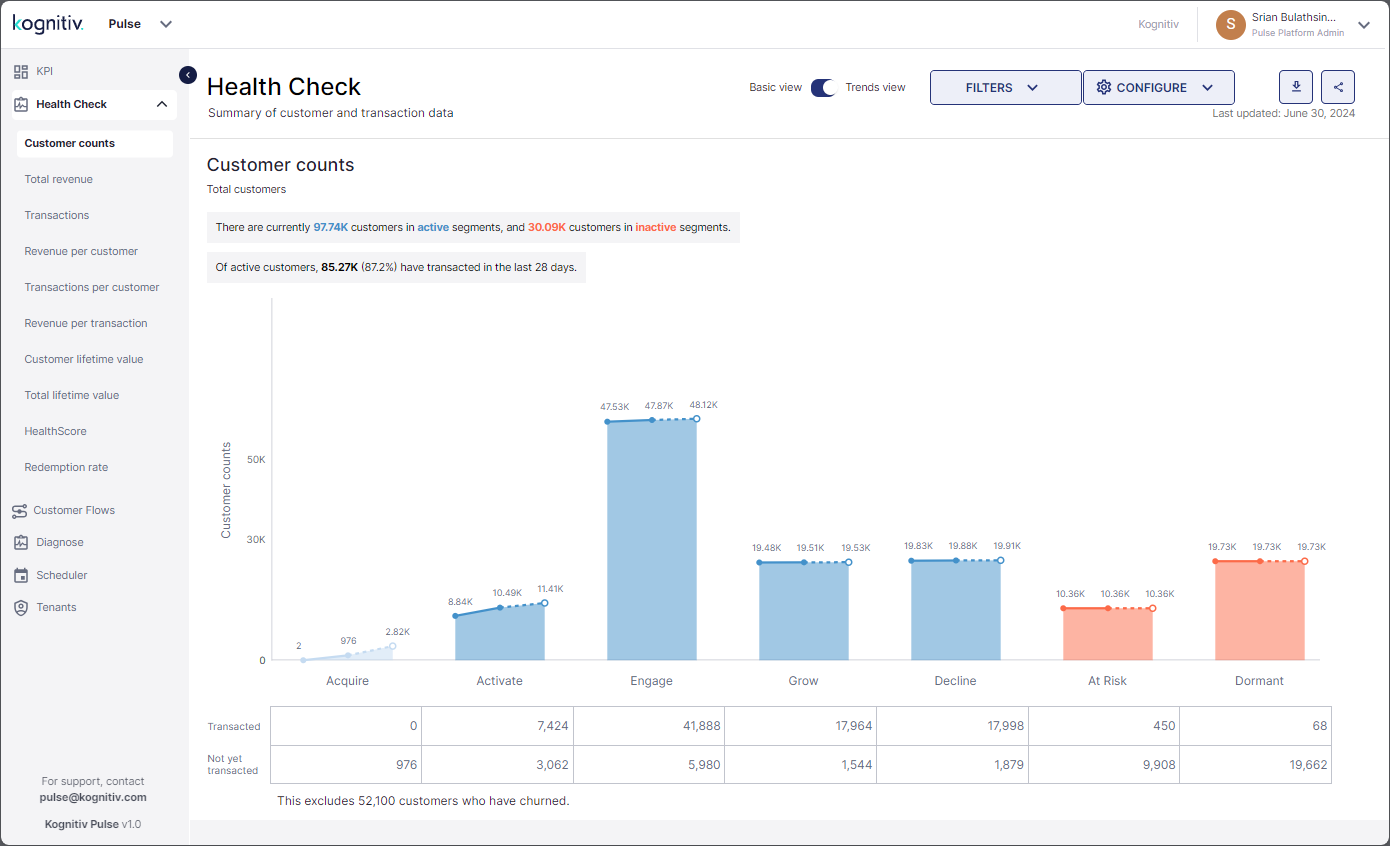
This report provides an overview of the growth in the different SmartJourney® customer segments over the business cycles allowing to identify the customer segments that are growing, stable or shrinking in the next business cycle.
Health Check (Trends View) - Customer Counts Report
At the top, the counts of the Active Customers and the inactive customers will be displayed. Below that, the count and the portion of active customers that transacted within the current business cycle will be given.
The graph displays the customer counts of the different customer segments in the past and present business cycles and the expected customer count for the next business cycle. Pulse will display the customer count values of the previous, current and future from the left to the right (i.e., the customer count for the previous business cycle will be displayed on the left, the count for the current business cycle will be placed in the middle and the predicted count for the next business cycle will be displayed on the right). An approximation of the customer counts is displayed in the graph. The exact values can be viewed by hovering over the bars in the chart.
The customer count growth from the previous to the current business cycle will be displayed by a solid line while the predicated growth from the current to the next business cycle will be represented by a dotted line.
Below the Customer Counts graph, the table displays the customer counts from the entire customer base that have transacted/not transacted within the current business cycle.
Total Revenue
Click Total Revenue to move to the Total Revenue report.
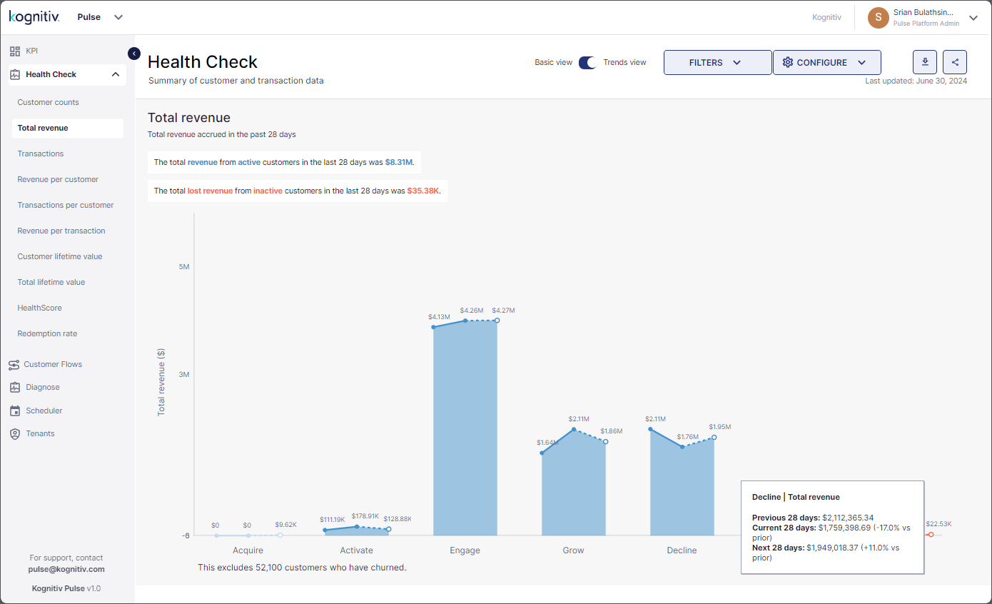
The Total Revenue report provides an analytical view of the Total Revenue generated from the different SmartJourney® customer segments in the past and current periods and predicted revenue for the next period.
Health Check (Trends View) - Total Revenue Report
The total revenue generated from the active customers and the total revenue lost due to inactive customers for the current business cycle will be displayed at the top.
The graph displays the revenue generated in the past and present business cycles and the predicted revenue for the next business cycle. Pulse will round off the revenue values displayed in the graph. Hover over the chart to view the exact values of the revenue generated from each customer segment.
Transactions
Click Transactions to view the Transactions report.
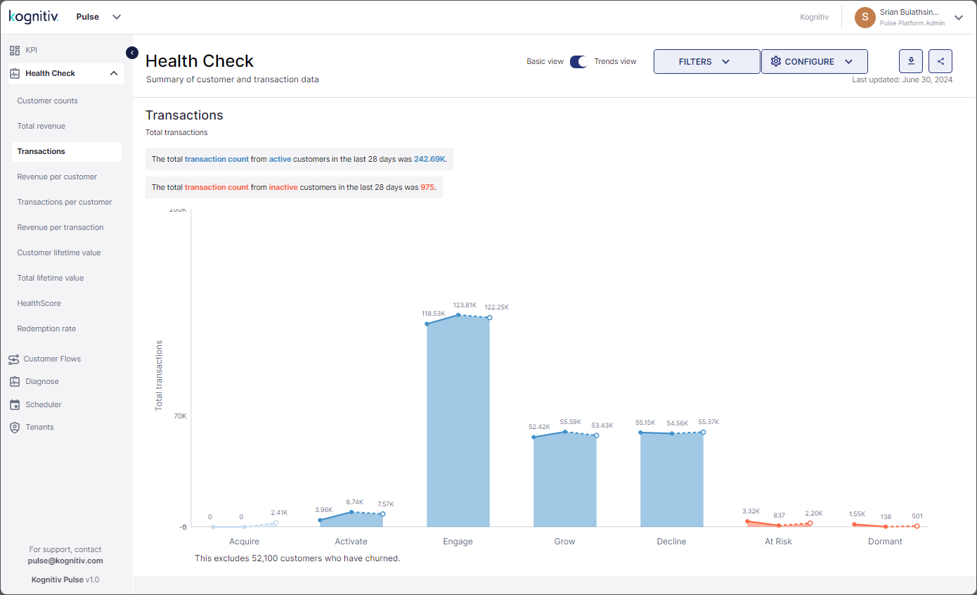
The Transactions report provide the performance of the Total Transactions KPI of each SmartJourney® customer segment for the past and current business cycles and the forecast of the total transactions for next period based on the trend followed by the KPI.
Health Check (Trends View) - Transactions Report
The total transaction count of all active customers and the transactions lost due to the inactive customers for the current business cycle will be displayed at the top of the Transactions report.
The graph provides a visual of the transaction counts of the previous, current and the prediction for next period for the different customer segments. Pulse will display an approximation in the graph and the exact values can be seen by hovering over the bars representing each customer segment.
Revenue Per Customer
Click Revenue Per Customer to view the Revenue Per Customer report.
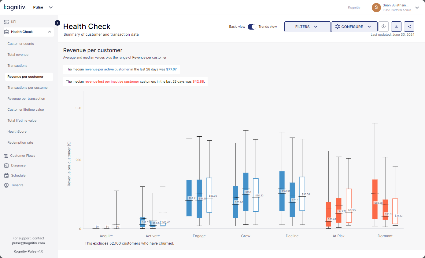
This report provides an overview of the KPI for the different SmartJourney® customer segments allowing to identify the segments that are predicted have the highest/lowest spending customers for the next business cycle.
Health Check (Trends View) - Revenue Per Customer Report
At the top, the median revenue per active customer and the median revenue lost per inactive customer for the current business cycle is displayed.
The boxplot charts will display the numeric value of the median revenue generated per customer for the past, current and future periods. The solid line represents the median value, and the dotted line indicates the average value. Each customer segment will have three boxplots where the boxplot on the left represents the previous business cycle, the boxplot in the middle represents the current business cycle and the boxplot on the right represents the expected revenue per customer for the next business cycle.
Hover over each boxplot to view more details including the range of the revenue generated per customer from each customer segment.
Transactions Per Customer
Click Transactions Per Customer to view the Transactions Per Customer report.
This report provides insights on the KPI from the different SmartJourney® segments for the given period allowing to identify the customer segments that will have the most/least positive transactions with the brand in the next business cycle.
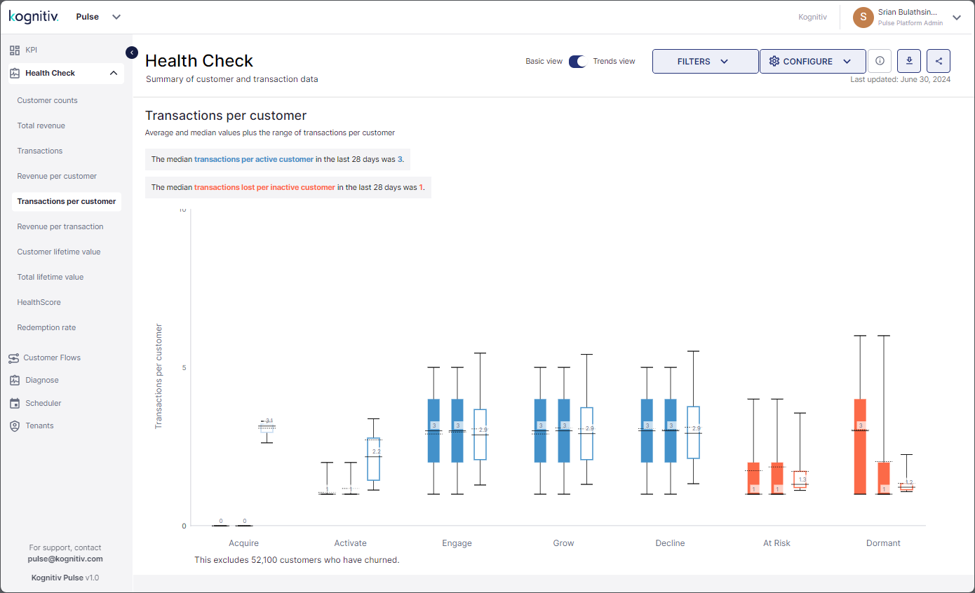
Health Check (Trends View) - Transactions Per Customer Report
The report displays the median number of transactions per active customer and the median number of transactions lost per inactive customer for the given period.
The boxplot chart will display the median transaction count per customer for the previous, current and future periods. Hover over each boxplot to view more details of the per customer transaction count.
Revenue Per Transaction
Click Revenue Per Transaction to view the Revenue Per Transaction report.
This report provides the revenue per transaction (Transaction Value) details for the different SmartJourney® customer segments for the past and current business cycles and the predicted spend per transaction for the next business cycle.
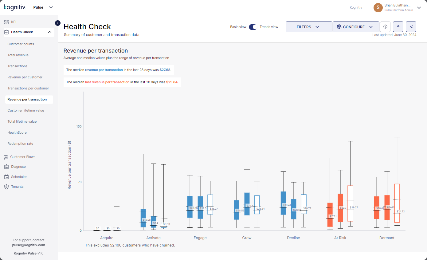
Health Check (Trends View) - Revenue Per Transaction Report
At the top, the report displays the median revenue generated per transaction from the Active Customers and the median revenue per transaction lost due to inactive customers for the current business cycle.
The boxplot chart provides details on the median revenue per transaction for the previous, present and future periods. The solid line indicates the location of the median value, and the dotted line indicates the location of the average value in the boxplot. Hover over each boxplot to view more details.
Customer Lifetime Value
Click Customer Lifetime Value to view the Customer Lifetime Value report.
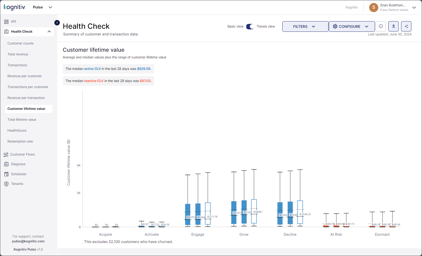
Health Check (Trends View) - Customer Lifetime Value Report
At the top, the median Customer Lifetime Value (CLV) of the active customers and inactive customers for the given period is displayed.
The boxplot chart displays value of the CLV for the last and the current business cycles and the predicted CLV for the next business cycles for the different SmartJourney® customer segments. Pulse will display the numerical value of the median CLV which will be represented by the solid line in the boxplots. The location of the average CLV will be marked with the dotted line. Hover over the graphs to view more CLV information on each customer segment.
Total Lifetime Value
Click Total Lifetime Value to view the Total Lifetime Value report.
The Total Lifetime Value report provides the total lifetime value of the different SmartJourney® customer segments for the previous and current business cycles and the expected total lifetime value of the customer segments for the next business cycle.
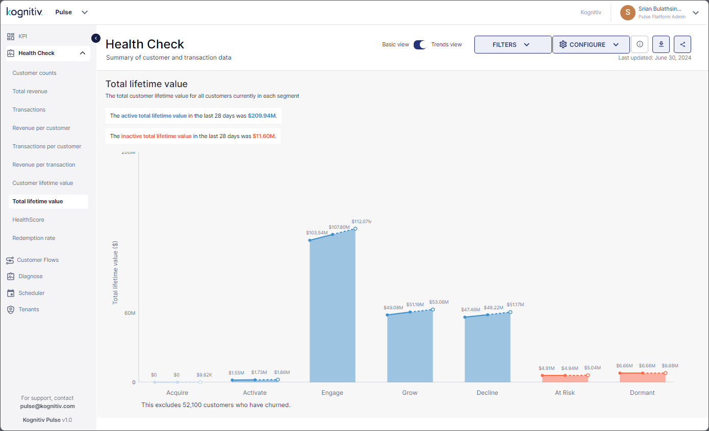
Health Check (Trends View) - Total Lifetime Value Report
At the top, the current total lifetime value of all Active Customers and the inactive customers will be displayed.
The graph displays the total lifetime values applicable for each customer segment for the last, current and future business cycles. Pulse will display the approximate values in the graphs. Hover over each graph to view the actual values.
HealthScore
Click HealthScore to view the HealthScore report.
The HealthScore report provides an insight on the changes of the HealthScore KPI for the different SmartJourney® customer segments in the past and present business cycles and the expected HealthScore of the customer segments in the next business cycle.
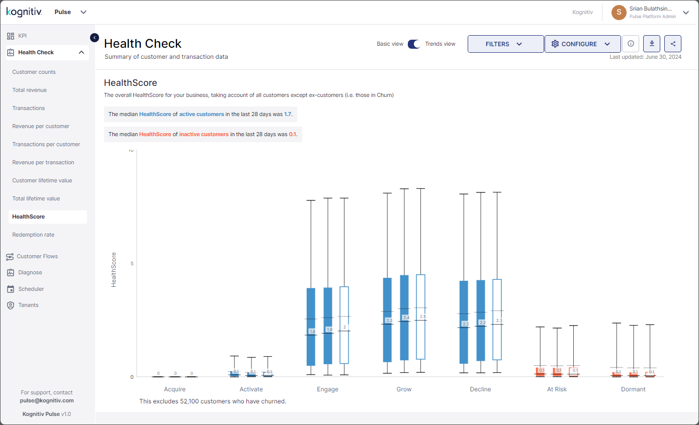
Health Check (Trends View) - HealthScore Report
At the top, the report displays the median HealthScore of the active customers and the median HealthScore of the inactive customers for the current period.
The boxplot chart displays the median HealthScore for the previous, present and future periods of each SmartJourney® segment. Hover over the boxplot charts to view more details.
Redemption Rate
Click Redemption Rate to view the Redemption Rate report.
The Redemption Rate report provides the percentage of customers that have redeemed their loyalty points during transactions from the different SmartJourney® customer segments for the previous, present and future periods allowing to identify the customer segments that have the highest/lowest point redemptions.
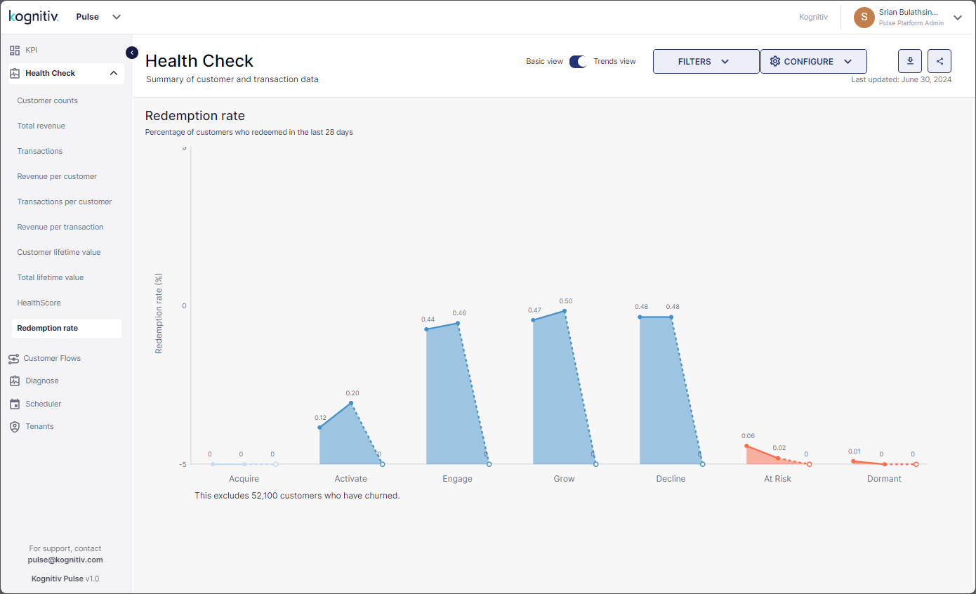
Health Check (Trends View) - Redemption Report